Thursday, January 31, 2013

You Make My Heart Fly Canvas *** Flying Unicorn KOM ***

This month's KOM "Celebrate Every Love" from Flying Unicorn contains a 12 X 12 stretched canvas.  The kit contained all sorts of elements I couldn't wait to use for my Off The Page project - the ideas started to flow as soon as I unpacked this yummy kit.

The kit contains a package of metal adornments from Flying Unicorn including a stunning three dimensional heart that I built my canvas around.


I'm so pleased with the way the flying heart turned out.  I started by coloring the metal with a Copic marker (R46 Strong Red), then added the Scrap FX Ornate Wings and some white feathers from my stash that I trimmed into shape once they were adhered to the rest.


To achieve the texture on the chipboard wings I coated them in embossing ink and Platinum UTEE.  I melted the UTEE and let it cool slightly, then pressed a stamp into the surface.  And voila, it bumped the visual interest up considerably.


For the background of the canvas, I started out by dabbing on generous amounts of white Gesso to seal the canvas and create texture.  While the gesso was still wet I pressed in some silver Pop! Micro Beads. I then misted the whole thing with Tattered Angels Plain Jane in Pink and dried it thoroughly.  I wanted lots of texture around the picture of Evan and our three boys, so I applied liberal amounts of molding paste, and I sprinkled Tim Holtz Distress Stickles Dry Glitter over it while it was still wet (you can see some in the picture below, but it is really apparent in real life).  I love this stuff, its chunky and gritty and oh-so-cool.  Once the molding pasted was dry I sprayed on Tattered Angels Plain Jane Rosey, which was included in the Embellishment Add-On, followed by TA Plain Jane in Light Blue through the Crafter's Workshop Cosmic Swirl mask.  I finished the background off with some Black Gesso from the Main Kit and Black Gelato around the outside.


I used Gelatos in pink, blue, white and black to color my Pink Paislee wooden alphas.

I had a lot of fun making this canvas - I hope you've enjoyed looking at it.

All the best!

Jackie

Flying Unicorn February Kit Reveal - Celebrate Every Love


Flying Unicorn
Proudly Presents to you

Love whether it's between a couple, a parent and child or an individual and their loved one is special. Love is an incredible feeling and has no price or limitations. Love should be celebrated every chance that we have because it's such a special and sacred attribute of life. We embrace you to celebrate your memories with our February Kit of the Month


Our kit is a a mix of Forget-me-Not by KaiserCraft, Authentique Lovely Collection, and Bella J'adore. With a mix of Prima Marketing Flowers and Manor House you will surely find passion in your creativity. We have included watercolor pencils to help you explore your creativity and we proudly introduce our line of Adornments with this special designer sample pack in the kit . The Off the page is by Canvas Corp, a 12x12 unbleached stretched canvas to make you explore your creativity even more. So join us this month in Celebrating Every Love.


Join Denise this month on February 03, 2013 in our BAP - Build a Page Thread where she will teach you step by step how to make this incredible layout

Playing with Bubbles! Join Tammy this month on our You Tube Channel and learn some techniques and inspiration using the watercolor pencils in your kit !


Tuesday, January 29, 2013

A Negative Space Layout featuring 13 @rts *** Flying Unicorn ***

I find negative space intimidating.  So when one of the challenges at this past weekend's crop on the Flying Unicorn Forums was a negative space challenge I just had to give it a try.  And wouldn't you know, it took me most of the darn weekend to do.  I drew heavily on the work of my fellow CT member Adrienne for inspiration; she is truly gifted when it comes to negative space.


These gorgeous 13 @rts papers are straight from Poland and available at the Flying Unicorn Store.

A couple closeups:


I misted the Manor House flowers heavily with Tattered Angels Plain Janes in Light Blue and Pink and gave them each a squirt of Shimmerz in Jenni B Bleu to change them from their natural cream to better suit the papers.  I used black Gelato heavily on this layout to tie the elements together.


With new CHA goodies arriving in the Flying Unicorn Store as we speak, I am trying to use up my stash to make room on my bulging Clip-It-Up, and I think I used up 4 packs of embellies on this one, as well as a bottle of crackle paint and one of Gel Medium - not bad!


Thank you for stopping by!

Additional supplies:

- Prima Lucerne Songbird Flowers
- Manor House flowers
- La La Land Creepy Vine die
- La La Land Large Flourish die
- Petaloo Velvet Wild Roses Pink
- Tattered Angels Plain Jane Mists Light Blue & Pink
- Dylusions Spray Black Marble
- Distress Crackle Paint Picket Fence
- Gelatos Black
- Distress Ink Weathered Wood
- Crafter's Workshop Mini Bricks mask
- Gloss Gel Medium (to stiffen the silver fabric)

Monday, January 28, 2013

Resolutions @ 34

One of the challenges over at the Flying Unicorn Forums this month is to scrap a goal or resolution for the year.  While I don't usually make resolutions, it just worked out that this year I did, and I took the opportunity to scrap it using Case File 52 from CSI: Color, Stories, Inspiration and a sketch from Scrapfriends.  Unfortunately it got pushed to the side several times while I worked on other projects and I did not complete it in time to submit to either CSI or Scrapfriends, but luckily I did finish it within the month LOL.


I used the gorgeous FabScraps Classic line from the Flying Unicorn store and trimmed each layer with lace for added definition.


I covered the Scrap FX swirl chippy with Glossy Accents and pressed in micro glitter in gold for shine and texture.


I'm trying to use up some of my stash in preparation for new CHA goodies, and these Prima flowers  and art tiles from the Printery and Almanac collections suited the layout perfectly.


And what was my resolution?


Being sidelined this fall due to injury I have gotten out of shape, and have let my normally healthy diet slip as well.  So with the end of the holidays it is time to resume eating healthy and making exercise a part of daily life.  So far so good, wish me luck that I can keep at it.

Additional Supplies Used:

- Pink Paislee alphas
- Kaisercraft lace
- Kaisercraft bling flourish
- Micro glitter
- Tsukineko coins
- Ranger kraft #8 tag
- Dylusions stamps
- twine
- burlap

Monday, January 21, 2013

Winterizing Craftsman Papers *** Flying Unicorn Mojo Monday ***

This week it was my turn to provide the inspiration layout for the Mojo Monday sketch in the Flying Unicorn Forums.  Creative Team member Adrienne's January challenge calls for creating a winter layout incorporating at least one non-winter themed item, and it just seemed perfect to marry the two together.


Here is the lovely Mojo Monday sketch from CT member Tammy Henderson.


I had a lot of fun creating this.  I started with Prima Craftsman Architect, Draftsman and Engineer papers (definitely NOT winter-themed!) and distressed and punched the edges.  I wanted to use the negative image of my Crafter's Workshop Winter Wonderland mask, so I dabbed Gesso onto the mask and then used it as a stamp on my background; once it was dry I outlined the snowflakes through the mask to tie them in to the sketch lines on the paper.  The photo mat is Tim Holtz Distress Ink in Salty Ocean over white cardstock.  I edged all my papers in gesso and black marker to tie the layers together and sprayed my background layer with Dylusions in Postbox Red and Shimmerz in Jenni B Bleu.


The snowflakes are Pink Paislee City Sidewalks and I coated my Dusty Attic Motif chipboard in Stampendous Aged Embossing Powder in Scarlet, another non-winter item.


The metal Bo Bunny embellishments were painted with Luminarte Silks Acrylic paint in Blue Flame, coming soon to the Flying Unicorn Store.


For the swirls in the sketch, I wanted to keep mine light and airy, like blowing snow.  To accomplish this effect I drew swirls on my craftmat in hot glue and once it dried dabbed on Mix'd Media Inx in Jasmine.  I then peeled them from the craftmat and adhered them to my page using Glossy Accents.  Strange to adhere an adhesive, I know, but I didn't want to risk having them turn out wrong and be permanently adhered to my page.


In this photo you can see the texture on the inked cardstock.  Kaz at the Little Shabby Shed developed a great technique of using soap bubbles on distress ink she calls Bubbly Distress and I couldn't resist playing around.  This is just a small taste, but the effect is really neat.

I hope you'll stop by the Flying Unicorn Forum and play along with this week's sketch!

Saturday, January 19, 2013

Silks Acrylic and Hot Glue

I've been playing around with hot glue more since discovering Vivian Keh's YouTube Channel and trying out her technique on my hot glue tree art journal page.  Although I liked the effect of ink to give the hot glue color, I found that it would wipe off even when dry, and really wanted to try the technique with my Luminarte Silks Acrylics.

And so this tag was born.


After making the tree out of hot glue I wanted to try to make running water. This is a first attempt, but I'm really happy with the way the color and dimension turned out and I will be playing with hot glue and Silks some more. I started with a Ranger tag, layered on some of the corrugated Fancy Pants cardstock from the January Flying Unicorn kit, some masking tape, then added gesso to the masking tape so it would take color, sprayed on Tattered Angels Partridge in a Pear Tree (my go-to brown spray), inked the top of the tag with Distress Ink in Festive Berries and Squeezed Lemonade, then went to work with hot glue. I painted the hot glue with Silks in Blue Flame, Guatemalan Green and African Jade - the mottled effect created by layering colors is awesome. The sentiment is a Dylusions stamp.  Silks will be arriving in the Flying Unicorn Store shortly, how excited am I?!?

Here are a couple of closeups: 


See the texture achieved by the masking tape covered in gesso and then misted?

For the painting, I painted the hot glue first with Blue Flame, my darkest color, then once it was dry I added some dabs of Guatemalan Green and African Jade.  Notice the subtle mottling?  The depth of color you can achieve is pretty amazing.


Thanks for stopping by!

Tuesday, January 15, 2013

Flying Unicorn's WCYDW - Fun With Foil!

Flying Unicorn launched a new tutorial series, What Can You Do Wednesdays or WCYDW last week, and each Wednesday one of the members of the Creative Team will bring you a new tutorial to get your creative juices flowing.  This week it's my turn, and I am going to show you how to make some beautiful journal covers like these using foil tape from the hardware store and either Rub 'N Buff or Inka-Gold paints.


Supply List: 


1) Something you want to cover, whether it be a journal, chipboard or other fairly rigid surface
2) Foil tape - available from the hardware store
3) Chipboard, dies or die cuts (I used Maya Road Chipboard Mini Butterflies in one of my examples - the green one with the butterflies; in the example above I cut the letters using a die and my BigShot)
4) Adhesive for the chipboard - I used Glossy Accents as it allows me to reposition the chipboard unlike tape-type adhesives
5) Styluses, like those in the McGill Paper Blossoms Tool Kit
6) Black Acrylic Paint, such as Pitch Black Paint Dabber or Claudine Hellmuth Charcoal Black
7) Several coordinating colors of Rub 'N Buff or Inka-Gold
8) Glue N Seal if you are using Inka-Gold
9) Paintbrushes (optional)
10) If using a Smash book - Acrylic paint for the spine of the book (optional), though you can leave it as is or cover with foil like the rest of the book)


A Smash Book makes the perfect base for this project as it already has debossed images on the front cover, however you can also start with a plain chipboard cover and build up texture and dimension using diecuts and chipboard elements, as I do on the plain backs of my Smash Books.  


(I apologize, I am going to jump between different Smash Books for the tutorial as I had several in various stages of completion and each has a different pattern on the cover).

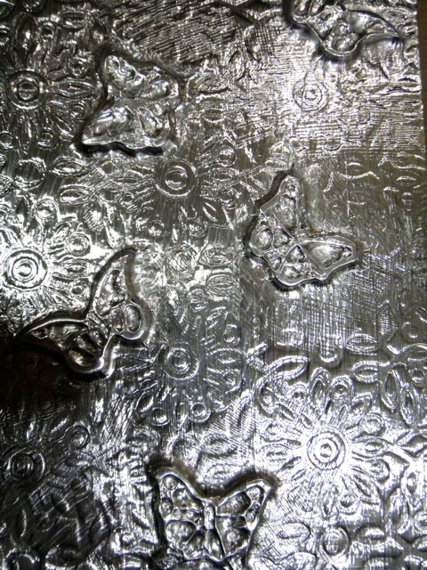
Part 1: Foiling The Cover

Step 1

Affix any chipboard or diecut elements you are going to use to your base using Glossy Accents.


You can see a glob of glue under the bottom butterfly from where I repositioned it.  Just blot it up the excess while wet and leave it to dry - you won't be able to tell after you've added the foil and paint.

Step 2

Cut strips of foil tape slightly longer than your journal cover.


Remove the backing of the first strip and adhere to your cover.  I laid the strips down one at a time so that I could ensure proper coverage once I'd worked the foil around the 3D elements.

Step 3

Use your stylus to push the foil into the recessed areas of your 3D elements.  I used a larger stylus for bigger areas, such as inside the butterfly wings and around the base of the butterflies, and a smaller stylus for the more detailed areas, such as the debossed flowers.  Work gently around bulkier items to prevent the foil from tearing.  (I had a couple small tears at the base of some of the butterflies, but the paint covers these up).


Lay down your next layer, overlapping your foil strips slightly to avoid having any of the cover peek through.

Here is the finished foil layer.  The stylus will leave little scratches in the foil, but these add to the distressed look.  If you prefer a nearly smooth application, you can use a paper nub to work around your details instead of a stylus.


The look of the foil on its own without painting is beautiful, and you might decide you like it so much you don't want to go any further.  Here are some examples:


The gears on the back cover are from the Tim Holtz Gears die.


Part 2: Painting The Cover

Step 1:

Decide what type of paint you would like to use.


Here is a test strip of foil - you can see how the Inka-Gold will work on either the painted or unpainted foil, but you achieve much more depth and texture over the painted foil, and the glimmer of the Inka-Gold really shows through.  The Rub 'N Buff works best on the painted foil; it is transparent over unpainted areas, allowing the foil to show through.

I will show you completed examples of all 3 methods (Rub 'N Buff, Inka-Gold over unpainted foil and Inka-Gold over painted foil); starting with Rub 'N Buff.

Step 2:

If you are going to use black paint as a base, paint it on liberally.  You want the first part you painted on to still be wet when you finish the application.


Step 3:

When the paint is somewhat dry but still tacky, blot off, revealing some of the foil.  The debossed areas will retain more paint than the rest of the foil.


Here is what it looks like after blotting:


Step 4: Rub 'N Buff

Choose what color of Rub 'N Buff to use for your base and squeeze some out onto your craft mat.  I used Ruby to give it a rusted look.


Using your finger, apply to your cover, allowing some of the black to show through.  Because this is your bottom color, you want to be generous; much of the color will get covered up by subsequent layers.  Once you apply it to the cover spread it around quickly as it sets within a short period of time.


 Looks pretty good even with just one color!

Step 5:

Add subsequent layers of color.  Rub N Buff is great because you can layer different colors without worrying about them muddying each other.  Once one layer is on it is set, and you can apply lighter or darker shades over top of it.

I applied Patina next.


Then finished off with Silver Leaf.


You can then embellish further if desired.  Because I want the covers of my journal to lay flat when I am using it I chose to leave it as is, though I will likely paint the binding a more muted color.

Inka-Gold Over Foil:

Inka-Gold is my go-to paint for Off The Page products, and I was so excited when the Fling Unicorn Store started stocking it.

For this cover I applied the Inka-Gold directly over the foil.  You can see that there is much less contrast and definition.


I applied Gold all over with my finger first, then mixed a little bit of water with Green-Yellow and painted that on. Because I hadn't mixed the Gold with water the highlights are visible despite using watered-down Green-Yellow over top.  I then painted the flowers with Violet and then hit the raised portions of the flowers and the butterflies with Steel Blue and Copper

Because Inka-Gold is water soluble, it is a good idea to cover it with a thin coat of Glue and Seal if you are using it on a project that will be handled a lot, such as a journal cover.

Here is a similar project I completed using Inka-Gold over black acrylic.  You can see how much more depth you get.


Painted foil can be fun in smaller applications, as well.  For instance, how incredible would a chipboard wire dress form look covered in foil and painted for a steampunk layout?

Foil can also be embossed and then applied to a project and painted, as I have done on these papier mache letters from the October Flying Unicorn Kit of the Month.

The full post with details for the "BOO" letters can be found here.

And don't forget that Alcohol Inks and alcohol markers such as Spectrum Noir can also be used on foil and other metal embellishments!

I hope that you enjoyed this instalment of Flying Unicorn's What Can You Do Wednesday and that you will be inspired to play with some foil tape.