Friday, February 27, 2015

Prima February BAP

This month's Prima BAP is an incredibly cool sketch by the talented Keren Tamir. I was really intrigued by the crisscrossing lines, and how to execute those. Here's what I came up with.


I solved the crisscrossing lines dilemma by executing the lines in two different ways - for the upper line I used washi tape, lace trim, corrugated cardboard and two torn strips of paper to mirror the line on the bottom, and for the centre line, I traced the existing delineation on the "Timeless" paper from the Timeless Memories collection using Worn Leather and Tea Stain Color Bloom sprays for a subtle line.


For the background, I added stencilling with the Rock Wall stencil and modelling paste, then added some shading with Chalk Edgers, added some stamping, and outlined the rocks with a watercolor pencil.

The Manor Hinges chippies are from Blue Fern Studios; I covered them liberally with Copper Crackle Texture Paste and left it to dry, then added Deep Teal Color Bloom spray, dabbing it off the top and letting it settle in the cracks for an aged look.


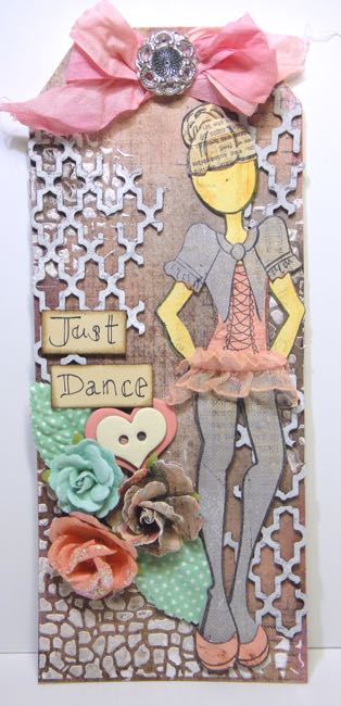
These gorgeous Prima blooms complement the amazing earth tones and texture of the Timeless Memories collection.


For a pop of colour, I finished it off with a chipboard title from Blue Fern Studios primed with gesso and painted with Color Bloom spray in Cobalt, then heat embossed with clear embossing powder.

Here is the inspiration sketch:


Thank you for your visit!

Prima Products Used:

Timeless Memories papers: Timeless, Everlast
Washi tape
Color Bloom sprays: Worn Leather, Deep Teal, Tea Stain, Cobalt
Texture Paste: Copper Crackle
6x6 Stencil: Rock Wall
Chalk Edgers: Branch Bark, Old Road, Shabby Tote
Stamp: En Francais Script
Flowers: La Tela (571139), Rodanthe Seashell (577766) , Rondanthe Sandbank (577742)
Stationer's Desk: Wood Icons (572877)

Blue Fern Studios Chipboard:

Manor Hinges
Mommy's Boy


Prima February PPP

Hi there! Eek, February's a short month, and here we are at the end of it and I haven't posted my entries for the Prima PPP and BAP yet! It's been a busy one, but I had to play along.

I loved the gorgeous, soft colours of this month's PPP, and used it as inspiration for a card.


I combined die cut doilies using the Prima Doily die and paper strips on a piece of Jodie Lee's Art Journal paper, and coated everything with a thin layer of white gesso. I then painted and dripped on some Color Bloom sprays, and added some stamping, then finished it all off with another die cut doily and gorgeous Prima flowers and embellishments.

Here's the amazing mood board:

Thank you for stopping by today! I hope you have a wonderful weekend!

Prima Products Used:

Jodie Lee 12x12 Art Journal Paper Pad
Prima Doily Die 572792
Something Blue 3x5 ATCs
Paper scraps: Divine, Cigar Box Secrets
Serenity flower: 571351
Lyric vines: 564513
Color Bloom Sprays: Soft Teal, Iris
Resin Frame: 892111
Something Blue flowers: 575304, 575335
Chalk Edgers: Coltsfood Stemens, Old Road
Princess collection Paperclips
Vintage Vanity stamp

Tuesday, February 24, 2015

A couple Julie Nutting birthday tags

Hi there! After a long blogger silence, during which I was creating, but didn't have time to photo, edit and post photos, I've gotten my butt in gear :) Today I'm sharing two birthday tags using Julie Nutting's Zoe Die/Stamp combo that I created for my sister and for my best friend, who have birthdays one day apart.

This first tag was made for my sister - for her birthday my sister, two of my sons and I went to a performance of So You Think You Can Dance, so I turned Zoe into a ballerina for this tag.


I used a combination of Stationer's Desk and Princess papers for the tag.


I added stamping, misting and stencilling with gesso to the background, then overlaid it with Blue Fern Studios Turkish Bits chippies covered in gesso and stamped.


For her tutu, I used some Tim Holtz trim folded over and sprayed with pink mist.


Some Prima Something Blue flowers and leaves finish the tag off.

The next tag is for my best friend. This time I used the Zoe stamp and die without any modifications. I wanted to do a collaged background inspired by Tim Holtz's February Tag of the Month, using Prima ATCs, tags and some ephemera from my stash. 


To help the collaged layers stand out, I added some washi tape, and outlined everything in Color Bloom mist, then added some stamping with the Prima stitches stamp and some Georgia Heald stamps, which I coloured in with more Color Bloom.


The hearts are Blue Fern Studios Heart Set chipboard - the red is coated with embossing powder, the turquoise one I coloured with an alcohol marker and then added clear embossing powder for a lacquered look.


Thank you for stopping in today!


Sunday, February 15, 2015

Daydreaming - 7 Dots Studio January/February Challenge

Hello friends! I'm stopping in today to share my entry for the 7 Dots Studio January challenge "Appreciating the Little Things in Life".

With three little boys, life is usually very busy. So the first thing that came to mind when I thought on appreciating the little things is how much I enjoy those small, infrequent moments when everyone is fed, happy and entertained elsewhere, and I can just kick back and relax for a couple minutes. I selected a picture of me relaxing on the hammock at my in-laws' summer cabin - having the opportunity to ride the hammock in peace for a couple minutes only happens once or twice a summer, so I really appreciate those times (who wouldn't with that view?).


I used papers from 7 Dots' Dreamer collection - this is one of those collections I missed out on when it was first released, and have always coveted. Imagine how excited I was when Limor Webber brought it in a couple of months ago! I cut the squares out of one of the City Lights pages, then outlined the holes in black and affixed it to the B side of another piece of City Lights. I took the cut out pieces and outlined them in various colours, then layered them onto my background using foam tape.


I added additional colour to the background and squares using Shimmerz Inklingz, and splatters of 13 Arts Splash Ink and mist before adding my embellishments and photos.


To complement my outdoorsy photo I used lots of natural elements - cork stickers, bark wooden icons, a nest, flowers - and tied all the elements together with a touch of gesso.


Here is this month's Inspiration Circle. The challenge is open until February 19th.


Thank you for stopping by! I always appreciate your visit.


Supplies Used:

7 Dots Studio Dreamer Collection - City Lights x 2
Faber-Castell Stamper's Big Brush Pen - Black
Prima Mini Bouquet Rebecca 538569
Prima Serenity 571337
Prima Mini Sachet Rose 565954
Prima Bark Flowers 569297
Prima Seashore Paperclips 573089
Prima Stationer's Desk Wood Icons 572877
Prima Epiphany Cork Stickers 576172
Prima Cradle Robin 552899

Saturday, February 14, 2015

Grungy Valentine's Day Card

Hands up, everyone who finds male cards daunting. Yep, that's my hand way, way up there! But it's Valentine's Day, and I didn't want to give Evan a girlie pretty card, so I pulled out some of the Distress products in my stash, and set to work.


I started with a piece of Blue Fern Studios' Chunky Heart Panel chipboard, and ran it through an embossing folder to add some manly riveted texture before adding several colours of Distress Ink, with a final brush of Walnut Stain over the embossed bits and edges.


I ran an oversized Prima tag through the partner embossing folder, the added various colours of Distress Paints, some stamping, splatters of Splash! Ink and distressed and inked the edges.

Thank you for stopping in today - I hope you had a wonderful Valentine's Day with the ones you love.


Supplies Used:

Blue Fern Studios Chunky Heart Panel chipboard
Prima Julie Nutting Tag Pad
Distress Ink: Walnut Stain, Fired Brick, Rusty Hinge & Peacock Feathers
Tim Holtz Texture Fades: Diamond Plate & Riveted Metal
Distress Paint: