
Midway through this project I was cursing myself for being too ambitious, and if I were doing it again there are some things I would do differently, but I'm thrilled with how it turned out.

I started by painting the main part of the house with white acrylic paint and the roof with black since I wasn't sure how much would show through once I got going. In the end, only the small section along the edge of the roof and underneath the roofline are visible LOL.

I started with the roof, drawing bricks onto a red paper scrap from Glitz's Love Games paper using a pencil and adhering it around the chimney. I then set to work on the roof, cutting 1/2 strips of paper from Basic Grey's Little Black Dress line. I then cut 3/4 of the way through the strips at regular intervals to create the texture of shingles. I laid them from the bottom upward so that they would overlap properly, and did each section of roof separately.

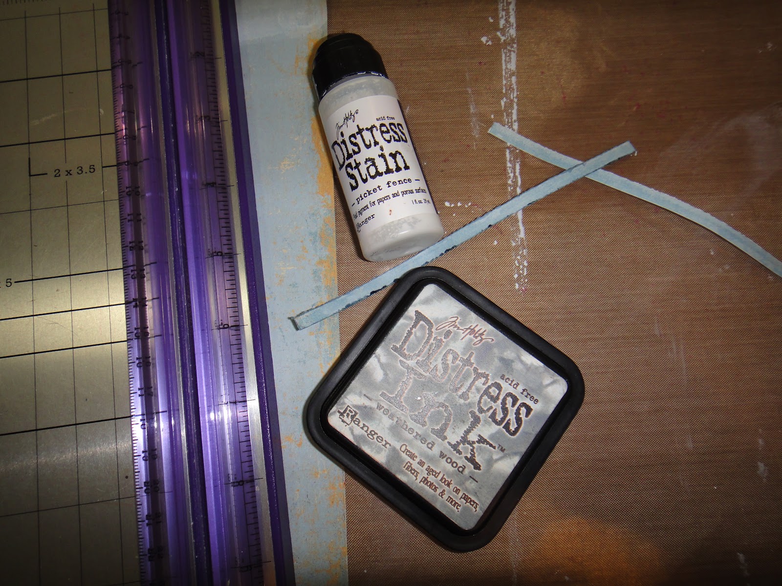
I chose a piece of Easy Breezy paper for the siding of my house, and coated the entire sheet with Picket Fence Distress Stain to give it a whitewashed appearance. I then cut the sheet into 3/16" strips, and cut these into random lengths for my boards, then wiped Distress Ink in Weathered Wood across the edges of each one. I adhered these with white glue; the glue that seeped out reacted with the Distress Ink, spreading the ink around and giving it the delightfully aged look I was going for.
Now here is where I wasted a lot of time. Fitting tiny little strips of paper around and between the 48 window openings was long, finicky work. Once I was done I could not find a way to do the window trims that wasn't too bulky for my design, so I ended up covering the whole thing up. You can see in the photo below that each window had four little openings for the panes; I punched out 1 1/2" squares of white cardstock, which I edged in Weathered Wood, and 1 1/4" squares of black cardstock which I coated with Picket Fence Distress Stain to give it some texture, like reflective glass.

I wanted faux stonework for the foundation of the house, but didn't have any paper that looked like stone, so I set out to create my own. I chose a piece of patterned paper called "Bliss" from Donna Salazar's Botanique line. As you can see, it looks nothing like stone, but it had the colors I was after.

I used a pencil to draw in random stone shapes, the traced between them with a white poster pen to imitate mortar. What do you think? I think it turned out pretty well, if I do say so myself.

And here it is on the house. For the door I used another scrap of the Love Games paper, covered it with Picket Fence, and drew in the outline of boards using a warm grey Copic marker.
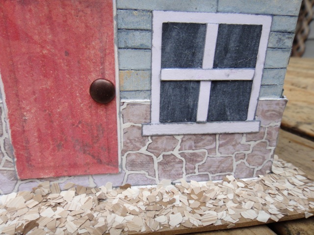
A beach house wouldn't be complete without sand, so I added some Fran-tage in Taupe to finish things off.

Thanks for stopping by!
Jackie
2 comments:
You did an amazing job with the beach house, so much amazing detail!! Looks like a lot of work!!!
Hi Jackie, please to meet you!
Wow, this alter of yours looks amazing! Congratulations!
xox Julia Sáddi - Brazil
Post a Comment