Here is my first layout with this kit, my grungy, all-boy layout of my oldest son doing what he did all summer, riding hard in the bike park. It is amazing to see my boys enjoying themselves so thoroughly for hours on end doing something that is good for them.
I wanted a real beat-up look to my papers, so I started out distressing the edges, then inked then with Vintage Photo and Tea Dye Distress Inks and sprayed them with water, then crumpled them up the way I wanted them. When the wet paper sets, it sets stiff, so I nested my lighter paper inside the darker one to make sure everything would fit before hitting it with my heat tool. I used the Kaisercraft Vintage Fence stamp included in the Embellishment kit and some Shaded Lilac Distress ink from the Spring 2012 Limited Edition release available in the store to add some visual interest to the background.
I pleated my leftover strips and inked them, then ran them through the sewing machine and added them to the mat under my photo along with some corrugated cardboard that I distressed and painted here and there with the Vintage Photo Distress Crackle Paint included in the main kit.
The embellishment add-on contained a tin of Tim Holtz Film Strip Ribbon, which I made into these funky flowers, then spritzed then with the Sheer Shimmer Spritz included in the main kit.
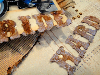
I cut my title using the Tim Holtz Vintage Market die, then inked the cardstock with Shaded Lilac Distress Ink and topped the whole thing with the Rock Candy Distress Crackle Paint Included in the embellishment add-on. Once the letters were dry I inked over them with Vintage Photo.
The photo had great movement to it, but I wanted to really frame the action. Heidi Kelly did a layout recently showcasing how she cuts out a duplicate of her photo and mounts it above a frame to highlight it, and I couldn't wait to try this technique; the Kaisercraft Photoframes included in the main kit gave me the perfect opportunity. I fussy cut the picture of Elliot on his bike out and mounted it above the first photo and outside the frame using foam adhesive.
Thank you so much for stopping by. I have much more to share from this beautiful kit as the month goes on. Get yours quickly before they sell out!
Jackie


1 comment:
I love your page Jax!! WTG!
Post a Comment