Thursday, April 21, 2016

A birthday card

My middle son, who's seven, was invited to a girl's birthday party this past weekend, so I got the chance to make a girly card! The two of them have been friends since they were 2 years old, and I love that their friendship has survived all the vagaries of elementary school. Though he did glom on to the only other two boys at the party, her older brother and his friend, for solidarity, he had a great time. 


Thank you for stopping by!

Prima supplies used:

Julie Nutting Tag Pad (910235)
Julie Nutting stamp: Betty
Cartographer paper: Boussole
Garden Fable paper: Primrose & Proper, Birdhouse
Royal Menagerie paper: Fly Free
Super Heavy Gesso
Color Bloom Sprays: Boysenberry, Summer Sky, Lime Wedge
Prima Alcohol Markers: Light Skin


Saturday, April 9, 2016

Altered flask

Awhile ago I saw a YouTube video for an altered flask. Though I took mine in a completely different direction, I was inspired by the video to go out and find a plain steel flask and make it my own.


I started by running several strips of foil tape through my embossing machine using a Tim Holtz embossing folder (my favourite). I then carefully adhered it to the flask, including to the screw cap, and pounced on several colours of Alcohol Ink. 


This gave it an incredible worn, aged look. 

For the centrepiece, I started with a Prima Relics and Artifacts piece from the Chivalry set, which I painted with Art Alchemy paints, silver foil, and Stickles. I set this on a large metal piece atop a scrap of distressed Prima paper, with Junkyard finding screws in the corners. 


For the backside I attached some Prima scraps as well as a fussy cut clock, aged with Chalk Edgers.


Various Prima trinkets hung from Louviere chains completed the project. 

I hope you enjoyed checking out this project as much as I enjoyed making it. Thank you so much for stopping by today. 

Friday, April 8, 2016

Altered Elephant

I recently picked up an inexpensive paper mache elephant at the craft store to try my hand at altering something Finnabair-style. I love her altered horses, and set off to alter my elephant in the same vein. 


I started by painting the whole thing with black gesso to prevent mediums from soaking through or making the paper mache soggy. I then added doodled circles and dots to the haunches and details to the trunk, tail and toes with pearl pen and repainted the whole thing with a second coat of black gesso. I then added a generous coat of clear crackle paste to the elephant's back, and left the whole thing to air dry. Once it was dry, the fun began. I mixed many different colours of mica powder with gloss gel, painted on mica-rich paints, and rubbed mica powder on with my fingers. Once all the paint had dried, I rubbed gold Inka Gold over the raised doodles and crackles for extra texture and definition. 


A chain lead-rope and some additional metal embellishments finished this beauty off. 


Thank you for stopping by today!


Thursday, March 31, 2016

Prima March 2016 PPP

Hi guys! I'm here to share my take on the March 2016 Prima PPP. I'd already started altering this scotch bottle I'd saved for the purpose when Miranda Edney shared her wonderful altered bottles on Live With Prima, but I do have to confess I picked up a couple suggestions from her and incorporated those into my bottle.

I was really excited to incorporate the new Opal Magic Violet-Green paint and Artisan powders into this project, and everything grew around my desire to try out those two products.


I started by painting the clean bottle with white gesso. Once it had dried, I then used a foam brush to pounce on super heavy gesso for a rough, weathered texture. I let it dry naturally, then painted it with some Opal Magic Violet-Green paint, which is green on a white background with a subtle violet shimmer. I later added Lime Wedge Color Bloom spray, painted on to control where it went. To add some weathering to the project, I used some Artisan powder (love this stuff!).


I had some old Chantelle Medallion lace flowers in my stash from years ago; I sprayed them with Cotton Candy and Peony Color Bloom Spray (and sprayed some seam binding at the same time) to incorporate the pinks from the PPP.   


For the grey in the color palette, I pulled out some of the new Salvage District papers. I adhered a "label" cut from one piece to my bottle using Gel Medium, and fussy cut details to act as a focal point.


My bottle topper is a sandwich of Vintage Vanity bottle caps with a second Medallion flower between them, filled in with Glass and Micro Beads in greens and topped with a Relics and Artifacts flame which I sprayed with spray adhesive and then brushed with Mica and Artisan powders.  

Here are some closeups:


Here is this month's PPP:


Thank you so much for stopping by!

Prima Supplies

Papers
Salvage District: Palais Royale, Chateau

Media
Heavy Gesso: White
3D Gloss Gel
Opal Magic Paint: Violet Green
Color Bloom: Lime Wedge, Tea Stain, Cotton Candy, Peony
Artisan Powder: La Chapeliere
Mica Powder: Vintage Pink
Chalk Edger: Branch Bark

Embellishments
Junkyard Findings: Vintage Trinkets
Cinnabar Bottle Caps
Zephyr Velvet Trinkets
Glass Beads: Peacock Green
Micro Beads: Grass
Relics and Artifacts: Chivalry
Something Blue: Brads

Flowers
Chantelle Medallion
Leaves (578411)
Royal Menagerie: Maud
Tales of You & Me: Moi Aussi, Je T'aime

Saturday, February 13, 2016

Brotherly Love - Wonderful! More Than Words Challenge

Hello Bloggers! I'm playing along with the More Than Words challenge this month. The "word" part of the challenge this month is "Wonderful", while the "more" portion is to make your project sparkle.

When I think of the word wonderful, I think of the bond that my three boys share - their love is truly wonderful to me. Full of conflict and complexity, naturally, but also deep, goofy, enduring and beautiful - and I chose to celebrate that on my layout.


I am in love with dark background paper right now, and chose the dark, grungy tones of the Blue Fern Studios "Sanctuary" collection for my sparkly boy layout.


I started off by scraping some heavy gesso over my background, to which I added stencilling. I didn't have just the right colour of paint, so I cracked open a bottle of Liquid Pearls and used that, sprinkling in superfine glitter while it was still wet. I then splattered my background liberally with gold and blue mist to pull out the subtle background colours in the paper.


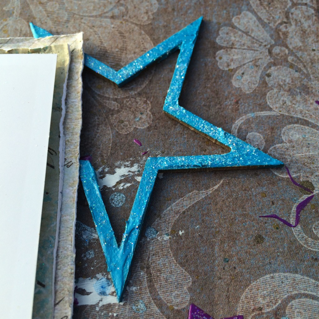
To continue on with the star motif, which I associate with a more masculine tone, I used the Blue Fern Studios Seeing Stars chipboard set, which I covered with Shimmerz Dazzlerz paint and sprinkled with glitter.


For a grounding, metallic influence, I heat embossed one of the Mixed Chains chippies in Midnight Copper and then dry brushed on some gesso.

I balanced all of the sparkle with some grungier elements: metals, cork and corrugated cardboard.


Even though it's a boy layout, I couldn't resist adding some flowers, but mixed in some metal and cork elements to help to integrate them to the rest of the layout. I love these Prima Winthrop vines - I think I bought them in every colour!


I had a lot of fun playing along with More Than Words, and can't wait for their March challenge!


Supplies Used:

Blue Fern Studios

Sanctuary Paper Collection:
- Correspondence
- Meadows of Time

Paisley & Vine Paper Collection:
- Playing Cards

Montage Collection: 
- Now And Then

Chipboard:
- Mixed Chains
- Seeing Stars

Prima Marketing Inc.

- Winthrop Flowers: Amethyst
- Sunrise Sunset Vintage Trinkets: Roman Numerals
- Epiphany: Cork Stickers
- Paperclips: Something Blue
- Junkyard Findings: Industrial Lamps
- Art Sugar
- Heavy Gesso: White
- Stencil: Stars
- Color Bloom Spray: Gold Foil, Antique Gold, Deep Teal, Soft Teal

Other

- Shimmerz Dazzlerz: Gummy Beary Blue
 - Lindy's Stamp Gang Embossing Powder: Midnight Copper
- Liquid Pearls: Majestic Purple

Tuesday, February 9, 2016

Better Late Than Never!

I had originally prepared this layout in July, but with everything else going on has sat in a pile for the intervening 7 months. I really love the brightness of it, though, so I'm pulling it out to share now. I used some of the lovely Blue Fern Studios Ombre Dreams papers for my background - they are still some of my favourites.


I wanted to go for an art journal style background, so I started off by masking with gesso, and then added layer after layer of masking with different mediums and finished off the background with some stamping. I punched assorted sizes of circles out of scrap bits, and coloured them with Gelatos before adhering them to the page and adding some doodling around them.


I cut the Blue Fern Studios Organic Vine chippy in half to bracket my photo, and applied several layers of blue and green paint, heat setting them for some bubbly texture. I adhered them to my page before splattering everything with black and white Splash ink from 13 Arts.


Some colourful Petaloo blooms and little Prima trinkets finish it all off.


Thank you for stopping by!

Supplies Used

Blue Fern Studios

Ombre Dreams paper collection:

- Leslie's Dream
- Dream Cards
- Charlotte's Dream

Chipboard:

- Organic Vine


Sunday, January 31, 2016

Blue Fern Studios January Challenge

Hello Bloggers! It's been a dry month creatively as my Dad passed away, but I did find the time this month for some art therapy playing along with the Blue Fern Studios monthly sketch challenge, one of my favourite monthly challenges. I used papers from the Sanctuary collection - I love the dark, vintage tones in this collection.


Here is this month's inspiring sketch:


I treated a piece of the Software Pieces chipboard with some Shimmerz Dazzlerz, and sprinkled on some Vintage Photos Distress Embossing Powder while it was still wet, then heat embossed the entire thing - it creates a bubbly, pitted texture on the paint and a rougher, rusty look on the embossing powder - then brushed some white gesso over it with my finger once it had cooled. I cut the piece in two to tuck under both sides of my photo.


For the Ornate Shelf chippy, I coated it in embossing ink, then sprinkled on several colors of embossing powder, heat set those, and added some more embossing ink and Distress powder, followed by gesso, for a rusty, worn look.


I also added some Distress powder to the corrugated cardboard under the photo to tie it to the chipboard pieces.


Some metal pieces and textured flowers add a touch of pretty to a masculine layout.


For the background, I stencilled Black Licorice Dazzlerz by Shimmerz through an Andy Skinner mask, then added superfine glitter while it was still wet. Once it had dried, I splattered the background liberally with different mists and some diluted wet gesso.


Thank you for stopping by today!