Wednesday, February 12, 2014

Mixed Media canvas

Hi there! Happy hump day. Just stopping in today with a quick share.

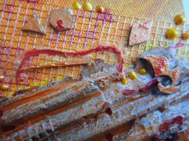
This canvas was inspired by a pair of canvases in the quiet study room of our club, the adults-only haven I retreat to when Brennan is in preschool and Colby is happily playing in childminding and for whatever reason I can't haul myself up to the gym. I love the blends of oranges, reds and textures, and wanted to play around with them at home.

This oval-shaped canvas was included in the Mixed Art add-on to the Flying Unicorn February kit of the month.


The canvas is already primed, so I started by misting it with various mists, then added mesh tape, cardboard, string and the little chipboard bits from some of my Blue Fern Studios chipboard.


I peeled apart a flimsy piece of corrugated cardboard, and painted it roughly with white gesso, then painted over it with gel medium. The gesso and gel blended together to make a really interesting texture and colour - kind of silvery. I painted the Blue Fern chippies with Shimmerz Dimensionz.


I coloured the strings with 13 Arts Water Ink to make them stand out, then added some stencilling with Distress Ink to finish everything off.

Supplies

Dylusions Lemon Zest and Pure Sunshine
Shimmerz Dimensionz Orange Up Pretty
Viva Pearl Pen Sunshine Yellow
Blue Fern Studios Blue Fern Bits
Distress Ink Vintage Photo
Crafters Workshop 6x6 stencil

Tuesday, February 11, 2014

Never A Dull Moment

Hello! Today I'm sharing my third DT project for Blue Fern Studios for February.  For this layout I used up my last full sheet of 7 Dots Wonderland paper (and could have wept - so sad to use up the last bits of your favourites, isn't it?), and I had a lot of fun building up colour and texture on an already colourful and textural background. I love this picture of Brennan, my middle son, and the look of disdain on his face, and wanted to use chipboard to draw the eye in to the photo.


The Graduated Circles were perfect for the task. I started by colouring the piece with a white Gelato, then built up additional colours with Gelatos and finished the whole thing off with random spots of coordinating Lindy's Stamp Gang embossing powders. I would later use the Graduated Circle as a frame for my clusters, which keeps the eyes moving around the centre of the page.


The Tattered Diamond Bits ground the photo within the circle, preventing it from looking as though it is just floating there. I started by heat embossing them with a weathered embossing powder, then added in Gelatos in orange and brown to marry it to my colour scheme.


For the title, I painted it with gesso and my finger, leaving texture behind, then misted it randomly to achieve an ombre effect.


And last but not least, a pop of purple Gelato to coordinate with the purple in the photo.


Products Used

- Never A Dull Moment chipboard
- Graduated Circles chipboard
- Tattered Diamond Bits chipboard
- Seaside Seashells chipboard


Thanks for stopping by!

Monday, February 10, 2014

Heads Up - Blue Fern Gardens paper!

I'm up on the Blue Fern Studios blog today to share my February Design Team projects, including one with the new Blue Fern Garden papers. I was so excited to receive these papers; they are so beautiful I almost couldn't bear to cut into them. Almost. I did get over it, and had a lot of fun in the process.


I love the lattice pattern of the Love Letters paper, and started by cutting it out with an X-acto knife, then used the pattern on the background Signature paper dictate how I trimmed the lattice. I wanted to leave the lovely birdcage and doily in the bottom right and the flowers and flourishes in the top left corners visible.


I glued the lattice down, then applied all my media overtop to make it an organic part of my background. Lots of layers here - misting with 13 Arts and Lindy's Stamp Gang mists, masking with 13 Arts Texture Paste, stamping, and some added texture with Shimmerz Texturez in Patina and Artie-Choked.

Lots of Blue Fern Studios chipboard scattered throughout. Frames are a great way to highlight a focal point on your photo; here I printed a second copy of the photo and fussy cut my youngest son Colby and the swing out of it and adhered it over the frame to bring movement to the picture. Of the three of us in the picture, there is no doubt who is the focal person (even more helpful when the photo is not particularly flattering of my eldest son and I). I started by rubbing a candle on the chipboard to create a bit of a resist, then painted and splattered on various coordinating colours of watercolour paints for a fun, artsy feel.


In addition to the lattice, there are lots of layers of paper and media on my background. I didn't want to cover these completely with additional layers of paper, but did want to add some additional bulk behind the photo; the Shabby Brick Bits were ideal for this purpose, and grounded the photo and cluster while allowing the background to peek through. I simply painted the chipboard with two coats of gesso, then added stamping and splattering.


Your chipboard doesn't always have to be the focal point of your layout. I needed a little something to bulk up my cluster, and this butterfly, painted randomly with watercolours, fit the bill perfectly.


With such a busy background, I wanted to make my title bold and simple to help it really stand out. A simple coat of black watercolour paint did the trick. I mounted the title on top of the flowers in my cluster with some wet adhesive.


Products Used

- Blue Fern Garden Signature paper
- Blue Fern Garden Love Letters paper
- Blue Fern Garden Calling Cards paper
- Shabby Brick Bits chipboard
- Picture Perfect chipboard
- The Optimist Word Set chipboard
- Icons Set One chipboard

Thanks for stopping by today! It's a holiday here for us in BC (Family Day), so we are enjoying an extra family day. I got my first ski day of the year in yesterday, and am hoping to get in a recuperative spa day today ;) It is also my beautiful younger sister's birthday, and if anyone should have a provincial holiday to celebrate her birthday, it's Emily.

Sunday, February 2, 2014

Flying Unicorn February KOM - Part 3

One of the amazing things about the Flying Unicorn kit of the month is that it always contains an off-the-page project to take your creativity in different directions. This month's OTP is a heart-shaped box (anyone else having a Nirvana flashback?).


I started by painting the whole thing with red acrylic, and when it was dry I added crackle medium. Once that was completely dry I covered the whole thing in black acrylic, and voila!


The silver coating on the hearts from the Mixed Passion add-on didn't work with my colour scheme, so I sanded the piece down then painted Inka Gold on roughly with my finger, leaving some sanded patches exposed.


 Isn't that little metal heart piece stunning? I played with Prima's new Stationer's Desk papers for the rolled pieces - love this collection and can't wait to get my hands on more of it!


To ground the paper pieces into the background, I stamped on some stitches using the Prima Stitched Lines from the add-on with Picket Fence Distress Paint.

Lots of gorgeous Prima flowers and some beautiful ribbon from the Flying Unicorn Store to finish everything off.

Thanks for stopping by! Make sure to check out the creations of the rest of the Creative Team here to see how very versatile this kit is.

Saturday, February 1, 2014

Blue Fern Studios February Sketch Challenge

It's the beginning of a new month, and that means a new sketch at Blue Fern Studios!  Here is my take on the sketch:


Although you do not have to use the specific pieces of chipboard used in the sketch, I had the "I Love You More" title and used it as a prompt to find the perfect picture. It was close - I almost picked a picture of my hubby - but when I came across this picture of my boys I couldn't resist.


To complement the grunginess of the papers, I painted some of the Widgetworks chippies using Inka Gold and then aged them with rusting powder and tucked them into my clusters along with some gold wire I up-cycled from a wine bottle.


I painted my title with a couple of coats of Tattered Angels Glimmer Glam in Be Positive, which I also flicked across the page.


Here is the wonderful sketch designed by Michele Singh.


I hope you'll play along with us this month! As always, there is a beautiful prize up for grabs.

Blue Fern Studios Products Used

- I Love You More words
- Widgetworks
- Blue Fern Bits

Friday, January 31, 2014

Flying Unicorn KOM Reveal - Part 2

The Flying Unicorn February kit of the month is on sale now, and both the main kit and the Small Art, Big Passion kit are perfect if you are in the mood to whip up some Valentine's Day cards. I was worried I wouldn't have time to complete my Creative Team responsibilities this month as I was away for nearly 2 weeks at CHA, so I took my kit with me and worked on some cards in the evenings in my hotel room.

For my first card, I used a new Prima Bloom Girl stamp (coming soon to the Flying Unicorn Store) and paper pieced her using the Kaisercraft Key To My Heart papers from the main kit. To add shading to the image, I went in with Gelatos and a paintbrush, and finished the whole thing off with a white Sharpie Poster Pen.


Hard to believe that every part of the image aside from the coffee cup is cut from one piece of Kaisercraft paper (Adoration).


The coffee cup, wooden banner and flowers were all coloured with Gelatos.


My next card is made using supplies from the Small Art, Big Passion kit. I taped one of the oval die cut frame cards on three sides to make an envelope for a tag, and trimmed the sweet little image from the kit down to fit inside. I just love the little girl, she reminds me of the Strawberry Shortcake I grew up with.


I added a piece of the Magnolia paper from the kit to the front, and added Gelatos, stamping and stencilling. 


The Kaisercraft Dusty Pink blooms from the main kit are the perfect size for an accent flower on a card.


 Thanks for stopping by! Be sure to pick up your kit; they sell out fast.

Thursday, January 30, 2014

Flying Unicorn February KOM - Part 1


My first project is inspired by Georgia Heald's Pop and Colours 2 workshop. I love Georgia's layered, grungy style, and found that it translated nicely to pink. Fortunately my boys don't mind being scrapped in pink!


Lots of yummy layers using papers, stickers, stencils and stamps from the kit.


Closeups:


 Be sure to grab your kit and add-ons before they're gone. Once they're gone, they're gone!