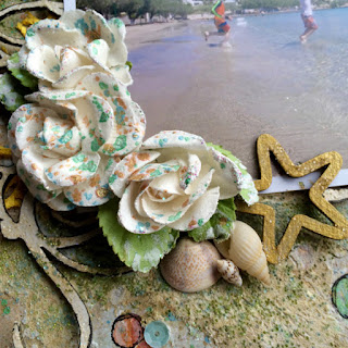
When looking through my stack of photos to choose one for this project, I came upon this picture of two of my boys running into the Aegean sea, and the Jimmy Buffett song "Changes in Latitudes, Changes in Attitudes" sprang into my head; I knew I had my photo!
For the bubbles I wanted a more dramatic ombre effect. I started by stamping the bubbles with a Prima stamp, then added three colours of Gelatos inside each one for a tapering of colour before finishing them off with some dry-brushed gesso. I added splatters to the background using Shimmerz Inklingz; I love to use dry watercolour pucks for this as I can add less water for more textural drops that aren't lost in the background colours. The Webster's Pages sequins added just the right sparkle and visual interest to keep things from being too two dimensional.
The Blue Fern Studios Swirlydoodle chippy was painted with white gesso topped with gold Shimmerz paint and chunky glitter; to help it stand out and to echo the outlines of the bubbles, I outlined it using a black Stamper's Big Brush pen.
I splattered the white Prima Winthrop vines with the same colours I used on the background and added some white gesso to the leaves to help integrate them with the rest of the page. The chippy star is painted with Prima Metallique paint in Ancient coin. To achieve a sandy look under the cluster, I added Ceramic Stucco to the page, and coloured it with some Color Bloom spray before pressing green and blue glass microbeads into the wet medium. I glued the shells in once everything was dry.
For a pop of colour, I used some yellow mesh trim upcycled from the wrapper of a Costco bouquet, and finished everything off with the "Joy" chippy coated in Aged Aqua Embossing Enamel, as the sentiment sums up pretty well the emotion my boys were feeling frolicking in the Aegean.
Here is the graphic for the More Than Words challenge (click on the graphic to be directed to the challenge post):
Thank you for stopping by today!
Products Used:
Blue Fern Studios Serendipity: Contemplation
Blue Fern Studios Chipboard: Swirlydoodle, Seaside Seashells, Good Vibes
Prima Métallique: Ancient Coin
Prima Flowers: Winthrop Vine - White
Webster's Pages: Party Time Sequins
Faber-Castell Gelatos
Prima Stamps: Don't Forget to Fly
Super Heavy Gesso
Prima Micro Beads: Splash, Grass
Prima Color Bloom: Tea Stain
Shimmerz Inklingz: French Twist, Giddy About Green, Me & Blue
Shimmerz Texturez: Artie-Choked
Shimmerz Blingz: Gold Glimmer
Shimmerz Shimmerz: Butter Cream, Tickle Me Turquoise, Sky Blue
Fancy Pants: Memories Captured Alphas
Stampendous: Aged Aqua Embossing Enamel
13 Arts: Splash Ink - White
Ceramic Stucco


3 comments:
Oh how clever! I love your interpretation of the word Changes. The colours are gorgeous too! Thanks for joining in at More Than Words this month.
Oh so very brilliant! Thank you for playing along with us at More Than Words!
This is so pretty, Jackie! LOVE!!!!
Post a Comment