Saturday, February 13, 2016

Brotherly Love - Wonderful! More Than Words Challenge

Hello Bloggers! I'm playing along with the More Than Words challenge this month. The "word" part of the challenge this month is "Wonderful", while the "more" portion is to make your project sparkle.

When I think of the word wonderful, I think of the bond that my three boys share - their love is truly wonderful to me. Full of conflict and complexity, naturally, but also deep, goofy, enduring and beautiful - and I chose to celebrate that on my layout.


I am in love with dark background paper right now, and chose the dark, grungy tones of the Blue Fern Studios "Sanctuary" collection for my sparkly boy layout.


I started off by scraping some heavy gesso over my background, to which I added stencilling. I didn't have just the right colour of paint, so I cracked open a bottle of Liquid Pearls and used that, sprinkling in superfine glitter while it was still wet. I then splattered my background liberally with gold and blue mist to pull out the subtle background colours in the paper.
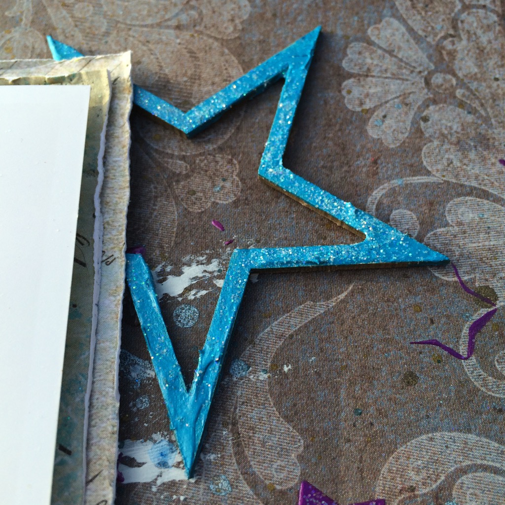


To continue on with the star motif, which I associate with a more masculine tone, I used the Blue Fern Studios Seeing Stars chipboard set, which I covered with Shimmerz Dazzlerz paint and sprinkled with glitter.


For a grounding, metallic influence, I heat embossed one of the Mixed Chains chippies in Midnight Copper and then dry brushed on some gesso.

I balanced all of the sparkle with some grungier elements: metals, cork and corrugated cardboard.


Even though it's a boy layout, I couldn't resist adding some flowers, but mixed in some metal and cork elements to help to integrate them to the rest of the layout. I love these Prima Winthrop vines - I think I bought them in every colour!


I had a lot of fun playing along with More Than Words, and can't wait for their March challenge!


Supplies Used:

Blue Fern Studios

Sanctuary Paper Collection:
- Correspondence
- Meadows of Time

Paisley & Vine Paper Collection:
- Playing Cards

Montage Collection: 
- Now And Then

Chipboard:
- Mixed Chains
- Seeing Stars

Prima Marketing Inc.

- Winthrop Flowers: Amethyst
- Sunrise Sunset Vintage Trinkets: Roman Numerals
- Epiphany: Cork Stickers
- Paperclips: Something Blue
- Junkyard Findings: Industrial Lamps
- Art Sugar
- Heavy Gesso: White
- Stencil: Stars
- Color Bloom Spray: Gold Foil, Antique Gold, Deep Teal, Soft Teal

Other

- Shimmerz Dazzlerz: Gummy Beary Blue
 - Lindy's Stamp Gang Embossing Powder: Midnight Copper
- Liquid Pearls: Majestic Purple

Tuesday, February 9, 2016

Better Late Than Never!

I had originally prepared this layout in July, but with everything else going on has sat in a pile for the intervening 7 months. I really love the brightness of it, though, so I'm pulling it out to share now. I used some of the lovely Blue Fern Studios Ombre Dreams papers for my background - they are still some of my favourites.


I wanted to go for an art journal style background, so I started off by masking with gesso, and then added layer after layer of masking with different mediums and finished off the background with some stamping. I punched assorted sizes of circles out of scrap bits, and coloured them with Gelatos before adhering them to the page and adding some doodling around them.


I cut the Blue Fern Studios Organic Vine chippy in half to bracket my photo, and applied several layers of blue and green paint, heat setting them for some bubbly texture. I adhered them to my page before splattering everything with black and white Splash ink from 13 Arts.


Some colourful Petaloo blooms and little Prima trinkets finish it all off.


Thank you for stopping by!

Supplies Used

Blue Fern Studios

Ombre Dreams paper collection:

- Leslie's Dream
- Dream Cards
- Charlotte's Dream

Chipboard:

- Organic Vine


Sunday, January 31, 2016

Blue Fern Studios January Challenge

Hello Bloggers! It's been a dry month creatively as my Dad passed away, but I did find the time this month for some art therapy playing along with the Blue Fern Studios monthly sketch challenge, one of my favourite monthly challenges. I used papers from the Sanctuary collection - I love the dark, vintage tones in this collection.


Here is this month's inspiring sketch:


I treated a piece of the Software Pieces chipboard with some Shimmerz Dazzlerz, and sprinkled on some Vintage Photos Distress Embossing Powder while it was still wet, then heat embossed the entire thing - it creates a bubbly, pitted texture on the paint and a rougher, rusty look on the embossing powder - then brushed some white gesso over it with my finger once it had cooled. I cut the piece in two to tuck under both sides of my photo.


For the Ornate Shelf chippy, I coated it in embossing ink, then sprinkled on several colors of embossing powder, heat set those, and added some more embossing ink and Distress powder, followed by gesso, for a rusty, worn look.


I also added some Distress powder to the corrugated cardboard under the photo to tie it to the chipboard pieces.


Some metal pieces and textured flowers add a touch of pretty to a masculine layout.


For the background, I stencilled Black Licorice Dazzlerz by Shimmerz through an Andy Skinner mask, then added superfine glitter while it was still wet. Once it had dried, I splattered the background liberally with different mists and some diluted wet gesso.


Thank you for stopping by today!


Monday, August 31, 2015

CSI Case File 172

Another "OMG, it's August 31st!" post :)

This month I played around with CSI: Color, Stories, Inspiration Major Case File #172. I loved the travel-themed image and the colors in the palette, but did grunge them up a bit with some brown shading to match the beautiful 7 Dots Studios papers I selected.

This is a photo of my three boys on the beach in Kini, Syros, Greece. The slant on the picture complemented the slant on the photos in the included sketch.


Here is the Case File:

For the "Evidence" elements I used: Nautical elements, wet mediums, metal and twine. For the "Testimony" I journaled about our outing to the small port of Kini on Syros to watch a spectacular sunset.

Here are some closeups:


The chipboard is from Blue Fern Studios and the papers are from 7 Dots Studios Dreamer collection.

Thanks for stopping in today!


Prima August BAP

I was sitting around on vacation this morning, staring at the rain, and it occurred to me that it is the last day of the month, and thus the challenge layouts I've worked on this month are due. I guess you tend to lose track of time when you spend 3 of the 4 weeks of the month on vacation. The time off has afforded me some scrappy time, though, which has been greatly needed.

Up first today is my entry for the Prima August BAP. I loved the swoosh in the background, as it gave me a great chance to use one of my beach pictures from our recent family trip to Greece.


Here is the BAP sketch it is based on:


I started by covering my background paper with clear gesso, then tinted some 3D Gloss Gel with Color Bloom sprays and scraped them through the Prima Bubbles mask. To help the stencilling pop, I scribbled outlines of the bubbles using a fine-tipped pen. I then diluted some white gesso and splattered it across the stencilled area.


For the swoosh on the sketch, I adhered Prima Glass Beads and Microbeads using 3D Gloss Gel, and once those were dry pounced on a little white gesso to give them a salt-encrusted look.


I finished it off with some beautiful Prima blooms, and some Blue Fern Studios chipboard.


Tuesday, June 30, 2015

Prima June PPP - Create Art

Just in time for the July challenges to be posted, I've got my entry for the June Prima PPP photographed and ready to post. This is a project that sat on my desk for awhile as I tweaked things here and there, but in the end I'm really happy with the results.


Here is the June PPP board where I got my inspiration for my 8x8 chunky canvas. Isn't it sumptuous?


I started by covering my canvas in papers from the Bella Rouge collection, inked with some Chalk Edgers, then set about adding layers of lace, torn paper and corrugated cardboard. I painted the cardboard with a dry brush and Prima Heavy Gesso in White, then added some green accents using Color Bloom spray on a paintbrush to get it into the grooves and Chalk Edgers for the peaks. I finished the cardboard off with random stamping with a Prima stamp.


I didn't have a vine in the right colours for the palette, but I did have all the bits and pieces to put one together - what do you think?


To make the vine I used flowers from several different collections and a pack of Prima leaves. I save the wire bits I cut off my flowers, and they came in handy here for the vine itself, to glue to the back of the leaves and for attaching everything together and adding little curly bits. I then wrapped the whole thing in florist's tape for a finished look, and dabbed on a little gesso to tie the flowers together.


I have been hoarding a lot of these bits and bobs, but decided where better to use them than a canvas I can look at every day?


A couple glass beads trailing behind my butterflies give the illusion of movement and keep them  from looking as though they are just hanging there.


Thank you for visiting today!

Prima Products Used:

- Bella Rouge papers: Belle Fleurs, Les Amours
- Vintage Vanity stamp: Triangles
- Color Bloom spray: Lime Wedge, Gold Foil, Antique Gold
- Chalk Edgers: Old Road, Ladybug, Black Coal
- Vintage Trinkets: Clock, Plated Labels
- Heavy Gesso: White, Black
- Stitched Lines stamp
- Wood Icons in a Box: Cartographer
- Bethany Leaves
- Audrey Flowers
- Mini Sachet Roses
- Timeless Memories flowers: Reflection, Butterflies
- Zipper pull


Sunday, June 28, 2015

Tough guy


Hi there! It's been a quiet couple of months for me for posting my scrappy work. Things have been busy for me personally and professionally, and unfortunately my crafting time is what suffers. I have had to make some cards during that time (which I will share shortly, now that they've been given out), but it's been awhile since I've undertaken a layout, so I signed up for the Round Robin Challenge this month at Swirlydoos so that I'd have to buckle down and get one done.

Here is my layout for Team 3, following inspirational layouts from Paula, Jeannie and Ginny.

I recently picked up a couple of great collections from Kaisercraft: Antique Bazaar and Scrap Yard, and couldn't wait to pull them out for this layout since the theme this month was "Boys To Men".


 This is a layout of my youngest a couple of years ago after a visit to the beach (that's sand, not a black eye, but I love the illusion as he is a bit of a bruiser).


I started with a lot of background work using paper strips, then coated everything with clear gesso and added painting with mists, stamping, stencilling and splatters.


I love this Mini Specimens stencil from Crafter's Workshop - so versatile, all the stencilling on this layout is from one stencil!


I pulled some perfect Blue Fern Studios chipboard from my stash. I altered the Circuitry chipboard using copper paint from Lindy's Stamp Gang and blue Distress Paint.


 The BFS Widgetworks was altered with embossing enamel, then splattered, along with the flowers and Circuitry piece, with Shimmerz Inklingz in several colours.


Thank you so much for stopping by today!