The Flying Unicorn is a proud sponsor of Sketchabilities and Cardabilities for September, and the Flying Unicorn CT has been invited to play along.
I created this layout of baby Colby playing with his water table in our backyard with the September Vintage Harmony kit from Flying Unicorn.
The Little Yellow Bicycle "Cottage Dreams" paper from the Patterned Paper Add-On was nearly perfect for my boy layout, all it needed were some splashes and splatters of watered-down gesso and some distressing.
These sweet little red flowers are Bazzil Basics from the Flower Add-On, as are the white "flatties" I've used beneath them. The hearts are VERY old Heidi Swapp; I painted them with Picket Fence Crackle Paint from the Embellishment Add On, then inked them heavily with Distress Ink in Festive Berries from the Flying Unicorn Store.
Here is Sketchabilities sketch #75. I hope you'll get a chance to play along!
Saturday, September 15, 2012
Friday, September 14, 2012
Do I Have Something On My Face? ** Flying Unicorn CT ***
Let me start off by saying, I love this kit!!! From the moment it came out of the box it has been a kit that just keeps on giving. I've completed 5 layouts and the OTP so far and I still have lots of product left for more.
I've said it before and I'll say it again, this kit is a little bit country and a little bit rock and roll. It will take you in all sorts of directions.
I have completely abandoned all gender/color rules in scrapbooking; I was tired of not using my pretty papers just because my three little boys are the subject of the lion's share of my layouts. So here is a layout of my youngest, Colby, after his first time eating chocolate chip pancakes. Doesn't he look plesed with himself?
Do I Have Something On My Face?

The layout is a mixture of Carta Bella and Kaisercraft from both the Main Kit and the Patterned Paper Add On. The letters are a mixture of Prima from the main kit and Webster's Pages from my stash. The beautiful pink ribbon and the Kaisercraft rubons are from the main kit, and those gorgeous rosettes are from the flower add on - I love the flower kit from Little Yellow Bicycle.
I have a couple more layouts prepared for different challenges that I will share throughout the month. Be sure to stop by the Flying Unicorn Store and pick up your kit before they are all gone!
I've said it before and I'll say it again, this kit is a little bit country and a little bit rock and roll. It will take you in all sorts of directions.
I have completely abandoned all gender/color rules in scrapbooking; I was tired of not using my pretty papers just because my three little boys are the subject of the lion's share of my layouts. So here is a layout of my youngest, Colby, after his first time eating chocolate chip pancakes. Doesn't he look plesed with himself?
Do I Have Something On My Face?
The layout is a mixture of Carta Bella and Kaisercraft from both the Main Kit and the Patterned Paper Add On. The letters are a mixture of Prima from the main kit and Webster's Pages from my stash. The beautiful pink ribbon and the Kaisercraft rubons are from the main kit, and those gorgeous rosettes are from the flower add on - I love the flower kit from Little Yellow Bicycle.
I have a couple more layouts prepared for different challenges that I will share throughout the month. Be sure to stop by the Flying Unicorn Store and pick up your kit before they are all gone!
Saturday, September 8, 2012
Flying Unicorn September KOM - Vintage Harmony OTP project
When the Flying Unicorn kit of the month arrives on the CT's doorstep, the kit's contents are a complete surprise. Alda, and each of the CT members in turn, keep their lips tightly sealed about what's inside. I'm second-to-last to receive mine, and I sit on pins and needles as I read each CT member's reaction to the kit contents. The OTP is what causes me the most angst, as it really stretches my creativity, but when I pulled this month's OTP out of the box I was all smiles. Now if only I could translate the vision in my head of a Cape Cod-style beach house onto the adorable papier mache house in the kit.
Midway through this project I was cursing myself for being too ambitious, and if I were doing it again there are some things I would do differently, but I'm thrilled with how it turned out.
I started by painting the main part of the house with white acrylic paint and the roof with black since I wasn't sure how much would show through once I got going. In the end, only the small section along the edge of the roof and underneath the roofline are visible LOL.
I started with the roof, drawing bricks onto a red paper scrap from Glitz's Love Games paper using a pencil and adhering it around the chimney. I then set to work on the roof, cutting 1/2 strips of paper from Basic Grey's Little Black Dress line. I then cut 3/4 of the way through the strips at regular intervals to create the texture of shingles. I laid them from the bottom upward so that they would overlap properly, and did each section of roof separately.
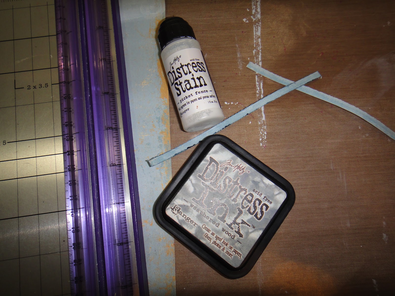
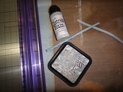
I chose a piece of Easy Breezy paper for the siding of my house, and coated the entire sheet with Picket Fence Distress Stain to give it a whitewashed appearance. I then cut the sheet into 3/16" strips, and cut these into random lengths for my boards, then wiped Distress Ink in Weathered Wood across the edges of each one. I adhered these with white glue; the glue that seeped out reacted with the Distress Ink, spreading the ink around and giving it the delightfully aged look I was going for.
Now here is where I wasted a lot of time. Fitting tiny little strips of paper around and between the 48 window openings was long, finicky work. Once I was done I could not find a way to do the window trims that wasn't too bulky for my design, so I ended up covering the whole thing up. You can see in the photo below that each window had four little openings for the panes; I punched out 1 1/2" squares of white cardstock, which I edged in Weathered Wood, and 1 1/4" squares of black cardstock which I coated with Picket Fence Distress Stain to give it some texture, like reflective glass.
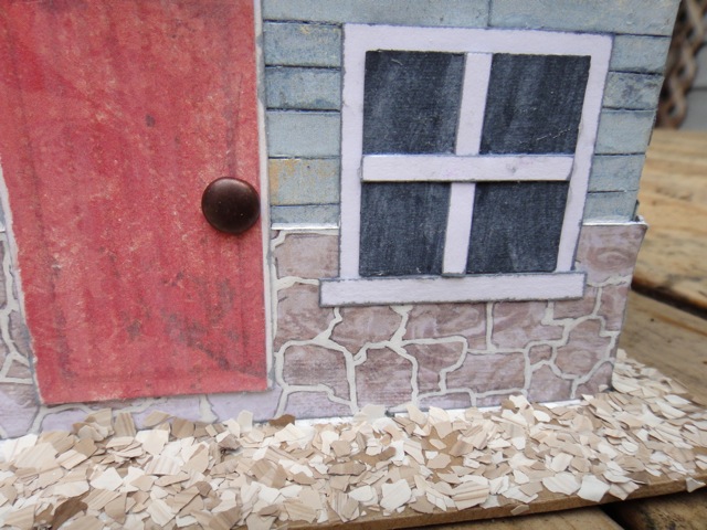
I wanted faux stonework for the foundation of the house, but didn't have any paper that looked like stone, so I set out to create my own. I chose a piece of patterned paper called "Bliss" from Donna Salazar's Botanique line. As you can see, it looks nothing like stone, but it had the colors I was after.
And here it is on the house. For the door I used another scrap of the Love Games paper, covered it with Picket Fence, and drew in the outline of boards using a warm grey Copic marker.
A beach house wouldn't be complete without sand, so I added some Fran-tage in Taupe to finish things off.
Thanks for stopping by!
Jackie
Midway through this project I was cursing myself for being too ambitious, and if I were doing it again there are some things I would do differently, but I'm thrilled with how it turned out.
I started by painting the main part of the house with white acrylic paint and the roof with black since I wasn't sure how much would show through once I got going. In the end, only the small section along the edge of the roof and underneath the roofline are visible LOL.
I started with the roof, drawing bricks onto a red paper scrap from Glitz's Love Games paper using a pencil and adhering it around the chimney. I then set to work on the roof, cutting 1/2 strips of paper from Basic Grey's Little Black Dress line. I then cut 3/4 of the way through the strips at regular intervals to create the texture of shingles. I laid them from the bottom upward so that they would overlap properly, and did each section of roof separately.
I chose a piece of Easy Breezy paper for the siding of my house, and coated the entire sheet with Picket Fence Distress Stain to give it a whitewashed appearance. I then cut the sheet into 3/16" strips, and cut these into random lengths for my boards, then wiped Distress Ink in Weathered Wood across the edges of each one. I adhered these with white glue; the glue that seeped out reacted with the Distress Ink, spreading the ink around and giving it the delightfully aged look I was going for.
Now here is where I wasted a lot of time. Fitting tiny little strips of paper around and between the 48 window openings was long, finicky work. Once I was done I could not find a way to do the window trims that wasn't too bulky for my design, so I ended up covering the whole thing up. You can see in the photo below that each window had four little openings for the panes; I punched out 1 1/2" squares of white cardstock, which I edged in Weathered Wood, and 1 1/4" squares of black cardstock which I coated with Picket Fence Distress Stain to give it some texture, like reflective glass.
I wanted faux stonework for the foundation of the house, but didn't have any paper that looked like stone, so I set out to create my own. I chose a piece of patterned paper called "Bliss" from Donna Salazar's Botanique line. As you can see, it looks nothing like stone, but it had the colors I was after.
I used a pencil to draw in random stone shapes, the traced between them with a white poster pen to imitate mortar. What do you think? I think it turned out pretty well, if I do say so myself.
And here it is on the house. For the door I used another scrap of the Love Games paper, covered it with Picket Fence, and drew in the outline of boards using a warm grey Copic marker.
A beach house wouldn't be complete without sand, so I added some Fran-tage in Taupe to finish things off.
Thanks for stopping by!
Jackie
Thursday, September 6, 2012
Flying Unicorn Sponsors The Color Room
The Flying Unicorn is a sponsor at The Color Room this month, and our CT has been invited to play along with their lovely palettes. I'll admit this palette gave me pause when I first laid eyes on it, especially the black and white chevron. I knew which photos I wanted to use for a multi-photo layout, and that I wanted to use the chevrons as mountain bike tire treads, but how to get them to blend was another matter entirely. What I settled on was printing out black and white chevrons on my home printer which I then coated with multi-medium and transferred onto my TH Kraft Resist; this is the first time I've done image transfer and I'm quite pleased with how it turned out. Enough of the white showed through, yet it wasn't so bright that it didn't fit with the grungy, down-and-dirty feel I wanted for my layout.
What do you think?
I stuck pretty close to the sketch for this one, getting my pops of color from splattered and dribbled Glimmer Mists and Basic Grey papers and alphas from my stash. I even had the perfect rub-ons for the doodles on the sketch! They are some old Basic Grey rub-ons from a layout kit.
Don't you just love happy accidents? I wanted to try to distress my photos, so I went over the edges with the wire brush on my Prima Distressing Tool. How surprised was I to discover that when the top layer of ink was rubbed off, the red of the layer underneath conformed to the palette!
Here is the palette:
What do you think?
I stuck pretty close to the sketch for this one, getting my pops of color from splattered and dribbled Glimmer Mists and Basic Grey papers and alphas from my stash. I even had the perfect rub-ons for the doodles on the sketch! They are some old Basic Grey rub-ons from a layout kit.
Don't you just love happy accidents? I wanted to try to distress my photos, so I went over the edges with the wire brush on my Prima Distressing Tool. How surprised was I to discover that when the top layer of ink was rubbed off, the red of the layer underneath conformed to the palette!
Here is the palette:
I hope you'll be able to play along!
Wednesday, September 5, 2012
Another Flying Unicorn Vintage Harmony Kit Reveal
Here is a second layout I created with this month's kit, Vintage Harmony, available from Flying Unicorn. I call this my "country shabby" layout because of the gingham paper. I don't think I've ever used gingham patterned paper before, but it seemed to fit right in with the pattern of Colby's shirt.
I used Carta Bella Beautiful Moments "Remember" and Kaisercraft Miss Match "Junk" papers from the main kit and Kaisercraft Miss Match "Odds" and "Ends" papers from the Patterned Paper Add-On, and coated all of the papers with a thin layer of gesso. The Petaloo Color-Me-Crazy chipboard gate is painted with Picket Fence Distress Crackle Paint to give it an aged feel, and I touched all of my flowers with gesso.
I used the August 27th Mojo Monday sketch from Flying Unicorn for this layout and flipped it around. Have you checked out the Mojo Monday sketches? There is a new fantastic layout to get you motivated every Monday.
Here are a couple of closeups:
I believe there are still a few kits and add-ons available in the store - get them while you can, 'cause once they're gone, they're gone!
Tuesday, September 4, 2012
Flying Unicorn Kit Of The Month Layout
This month's Kit Of The Month at the Flying Unicorn, Vintage Harmony, is amazingly versatile. This kit is a little bit country and a little bit rock and roll. I've done a funky layout, a grungy layout, a country shabby layout and a paint-spattered layout, and still have plenty left over.
Here is my first layout with this kit, my grungy, all-boy layout of my oldest son doing what he did all summer, riding hard in the bike park. It is amazing to see my boys enjoying themselves so thoroughly for hours on end doing something that is good for them.
I wanted a real beat-up look to my papers, so I started out distressing the edges, then inked then with Vintage Photo and Tea Dye Distress Inks and sprayed them with water, then crumpled them up the way I wanted them. When the wet paper sets, it sets stiff, so I nested my lighter paper inside the darker one to make sure everything would fit before hitting it with my heat tool. I used the Kaisercraft Vintage Fence stamp included in the Embellishment kit and some Shaded Lilac Distress ink from the Spring 2012 Limited Edition release available in the store to add some visual interest to the background.
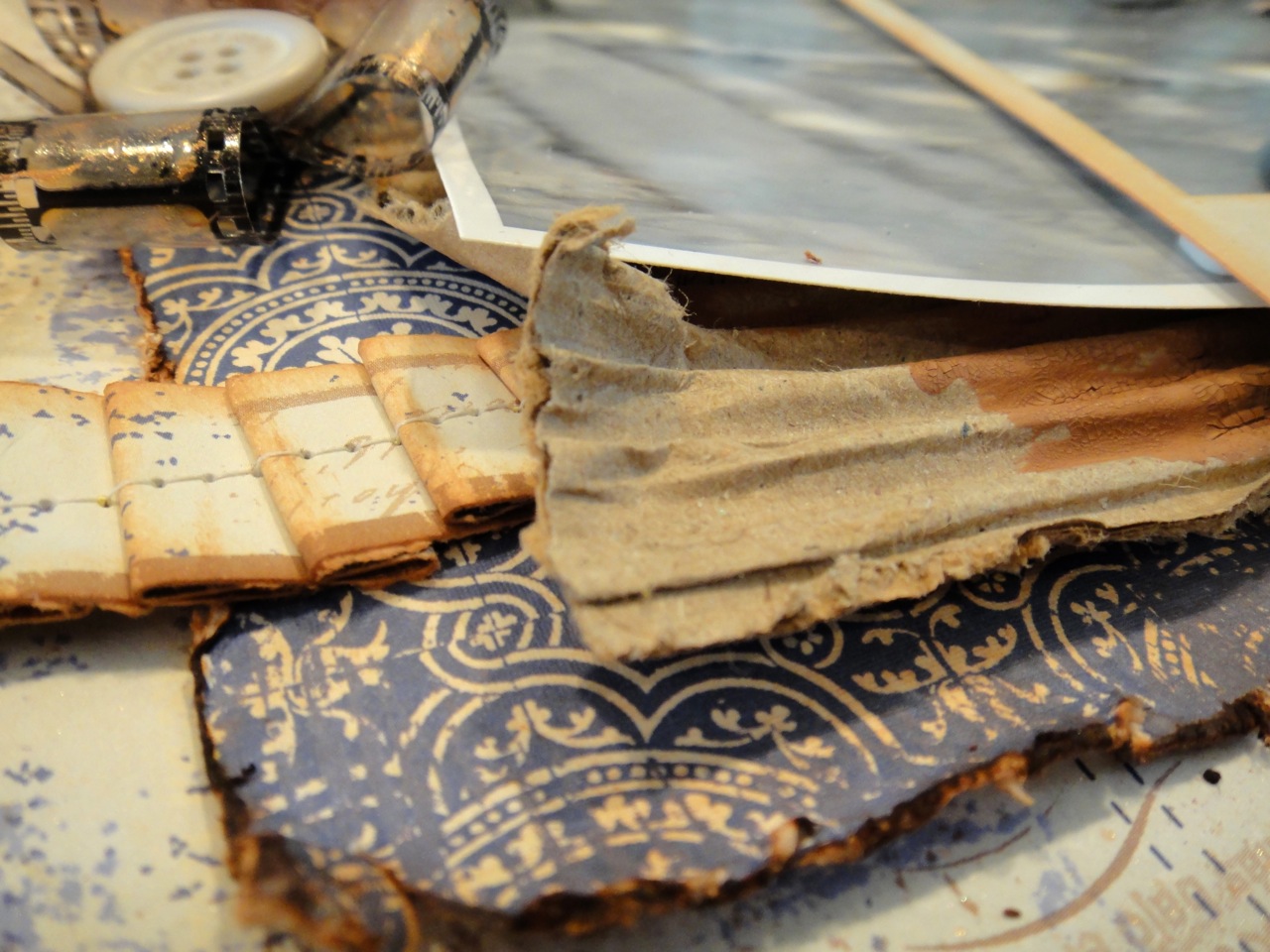
I pleated my leftover strips and inked them, then ran them through the sewing machine and added them to the mat under my photo along with some corrugated cardboard that I distressed and painted here and there with the Vintage Photo Distress Crackle Paint included in the main kit.
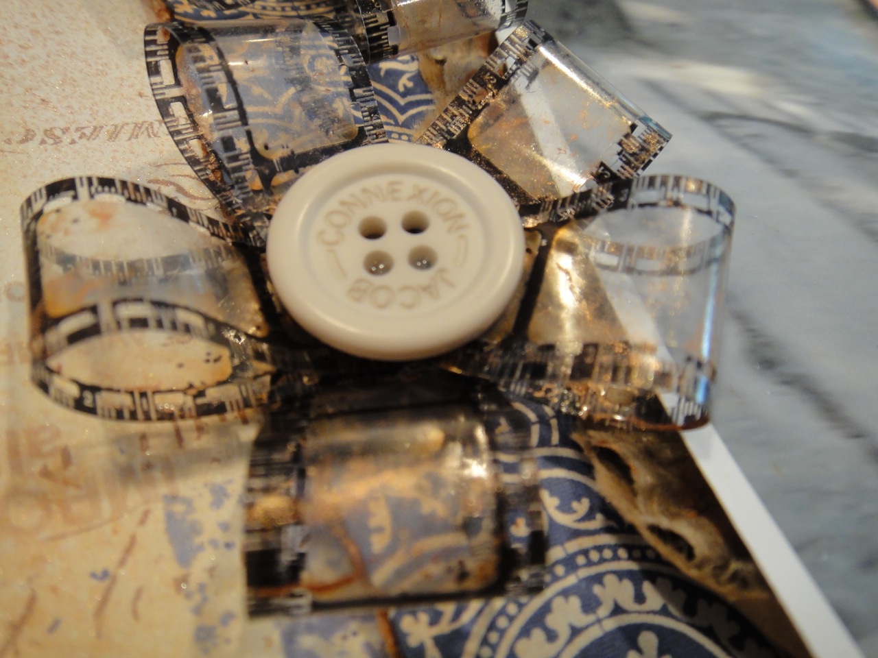
The embellishment add-on contained a tin of Tim Holtz Film Strip Ribbon, which I made into these funky flowers, then spritzed then with the Sheer Shimmer Spritz included in the main kit.
I cut my title using the Tim Holtz Vintage Market die, then inked the cardstock with Shaded Lilac Distress Ink and topped the whole thing with the Rock Candy Distress Crackle Paint Included in the embellishment add-on. Once the letters were dry I inked over them with Vintage Photo.
The photo had great movement to it, but I wanted to really frame the action. Heidi Kelly did a layout recently showcasing how she cuts out a duplicate of her photo and mounts it above a frame to highlight it, and I couldn't wait to try this technique; the Kaisercraft Photoframes included in the main kit gave me the perfect opportunity. I fussy cut the picture of Elliot on his bike out and mounted it above the first photo and outside the frame using foam adhesive.
Thank you so much for stopping by. I have much more to share from this beautiful kit as the month goes on. Get yours quickly before they sell out!
Jackie
Here is my first layout with this kit, my grungy, all-boy layout of my oldest son doing what he did all summer, riding hard in the bike park. It is amazing to see my boys enjoying themselves so thoroughly for hours on end doing something that is good for them.
I wanted a real beat-up look to my papers, so I started out distressing the edges, then inked then with Vintage Photo and Tea Dye Distress Inks and sprayed them with water, then crumpled them up the way I wanted them. When the wet paper sets, it sets stiff, so I nested my lighter paper inside the darker one to make sure everything would fit before hitting it with my heat tool. I used the Kaisercraft Vintage Fence stamp included in the Embellishment kit and some Shaded Lilac Distress ink from the Spring 2012 Limited Edition release available in the store to add some visual interest to the background.
I pleated my leftover strips and inked them, then ran them through the sewing machine and added them to the mat under my photo along with some corrugated cardboard that I distressed and painted here and there with the Vintage Photo Distress Crackle Paint included in the main kit.
The embellishment add-on contained a tin of Tim Holtz Film Strip Ribbon, which I made into these funky flowers, then spritzed then with the Sheer Shimmer Spritz included in the main kit.
I cut my title using the Tim Holtz Vintage Market die, then inked the cardstock with Shaded Lilac Distress Ink and topped the whole thing with the Rock Candy Distress Crackle Paint Included in the embellishment add-on. Once the letters were dry I inked over them with Vintage Photo.
The photo had great movement to it, but I wanted to really frame the action. Heidi Kelly did a layout recently showcasing how she cuts out a duplicate of her photo and mounts it above a frame to highlight it, and I couldn't wait to try this technique; the Kaisercraft Photoframes included in the main kit gave me the perfect opportunity. I fussy cut the picture of Elliot on his bike out and mounted it above the first photo and outside the frame using foam adhesive.
Thank you so much for stopping by. I have much more to share from this beautiful kit as the month goes on. Get yours quickly before they sell out!
Jackie
Sunday, September 2, 2012
Flying Unicorn September Kit Reveal
We are pleased to showcase this month's KOM - Vintage Harmony
· Kaiser Pearls
PAPERS :
PAPER LOFT
Easy Peasy Lemon Squeezy
Made in the Shade
Our Song
Something Old
Lifetime
KAISERCRAFT MISS MATCH
Trash
Bric Brac
Knick Knacks
Junk
ANNA GRIFFIN
AG1675
AG1708
LITTLE YELLOW BICYCLE
Blue Riverie
Pattern Play
CARTA BELLA
Damask
Remember
EMBELISHMENTS :
Technique Tuesday 12” Borders x 8
Prima Tiny Alpha Stickers
Kaiser Rub Ins Miss Match
Faber Castell Accents Sampler
Kaiser—Photo Frames x 2
Bingo Cards x3
Cards x 10
Shimmer Smritz—Copper
R anger Crackle Paint—Vintage Photo
Making Memories Charms x 2
Vintage Ribbon 12” and 18”
Perfect Pearls—Heirllom Gold
FLOWERS :
Petaloo Chatreuse x 32
Petaloo Small Daisy x 4
Petaloo Burgandy Vine
· PAPER LOFT
· Easy Breezy See yOu later Alligator
· Hunky Dory
· KAISER—MISS MATCH
· RUMMAGE
· TREASURE
· ODDS
· CLUTTER
· ENDS
ANNA GRIFFIN
· AG1713 AG1710 AG1674
LYB - Saturdays—Cottage Dreams
CARTS BELLA - Beautiful Moment
Chickadee paper
CORE’DINATIONS CARSTOCK
· Wicker Chair
· Sun Coral
· Iced Cocoa
· Burnt Sugar
· Rivulet
· Flamingo Lilly
· Snowflake
· Persimmon
· LAKEHOUSE STICKER SHEET
· Tim Holtz Film Strip Ribbon
· Petallo Laser Gates
· Kaiser Brick Stamp
· Kaiser Miss Match Die Cuts
· Distress Paint—Picket Fence
· Rock Candy
· Celebrations—White Flowers
· Bazzill Red Flowers
· Little Yellow Bicycle Paper Flower Kit
· American Craft– Anastasia
· Petaloo Florettes x 32
Check Out the amazing creations from the Creative Team
Subscribe to:
Posts (Atom)